/prod01/prodbucket01/media/durham-university/departments-/physics/teaching-labs/VT2A9034-1998X733.jpeg)
Figures, Tables & Graphs
Introduction
Figures and tables in a laboratory report have a particular standard of presentation, much higher than that of the figures you would put in laboratory notebook.
You may use any software you desire for producing graphs. Discovery Skills students will usually use Excel or other spreadsheet software, but at later levels the use of Python or other specialist data presentation software is encouraged.
Key Points
- If possible, place any tables and figures at the top and/or bottom of a page.
- Do not wrap text around figures or tables.
- Figures and captions should not be allowed to be split or separated by a page/column break.
- Be selective about which graphs and tables you use; consider combining relevant data.
- All figures and tables should have a caption and a figure or table number at the start of said caption (e.g. "Fig.3:" or "Table 2:").
- Captions should be short, standalone, and sufficiently informative that someone with the necessary knowledge would be clear about what the figure or table represents without having to refer to the rest of your report.
- All text on the figures, including captions, needs to be legible even after the figure is placed (and sized) into the document.
Graphs
Some key points worth noting regarding graphs:
- Design your graphs so that they are easy to read and clearly show all the key features;
- Graphs are figures, and should therefore have a figure number at the start of their caption ("Fig.1:", not "Graph 1:") and should be referred to as figures in your text;
- Take accessibility into account, including whether the graph will be meaningful to a colourblind person.
- Here is a checklist you can use to check your graphs are compliant.
Your graph should have…
- Axis labels with units;
- Error bars;
- Tick marks at sensible intervals;
- A white background (unless there is good reason not to);
- Maximum and minimum values so that the most amount of space is filled;
- Large, readable font which matches the size of the caption (note that resizing the figure can change the font size).
- Different curves differentiated not just by different colours but also by different line styles (solid, dashed, dotted, etc.), and different marker styles.
Your graph should not have…
- A title – Unlike in your laboratory notebook, figures do not have titles. Put this information in the caption;
- Gridlines;
- A border around the whole graph;
- A legend, unless the amount of data justifies having one. Again, this information should preferably go in the caption;
- The equation of any lines fitted to the data;
- Lines that only join data points point-to=point (and do not represent any trendlines or fits);
- Reliance solely on colour to communicate anything.
Below are two examples of graphs that have been produced using Excel - the first is a bad example, the second a good one -with commentary on their features.
/prod01/prodbucket01/media/durham-university/departments-/physics/labs/GoodGraph.PNG)
/prod01/prodbucket01/media/durham-university/departments-/physics/labs/BadGraph.PNG)
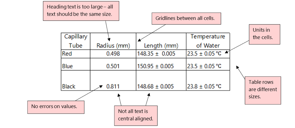
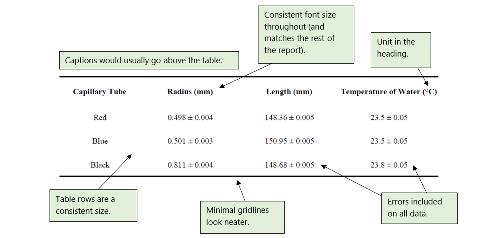
Tables
Like figures, tables must have a caption and must be numbered. Tables are not figures (i.e. not called Fig. 1, Fig. 2, etc.) and instead should be called Table 1, Table 2, etc.. Removing unnecessary horizontal or vertical lines will improve the presentation of your tables. All the entries, including the headings, should fit comfortably in the width or height of the columns or rows; long headings should thus be avoided. Below you can see a few other things to take note of when using tables.
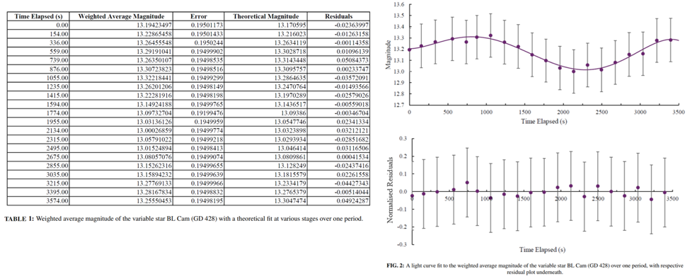
Don’t include tables of data when the information is adequately given in a graph or by a few words of text; this is redundant and wasteful of space. Below is the same data presented in two formats; if presenting your data in a graphical form enhances the ability to convey information (as is the case here) you do not need to include the table of data, just the graph.
Note that the Florence Nightingale Graphical Prize for Graphical Excellence is awarded at each level to exceptional presentation of data to illustrate physical phenomena.